
Wednesday, 30 June 2010
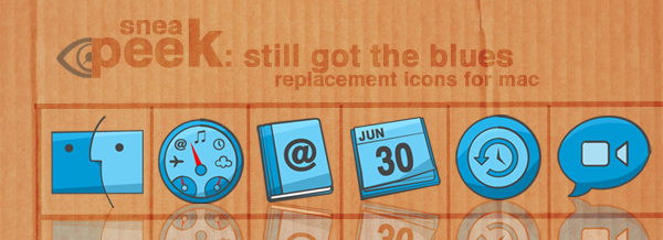
sneak peek: replacement icons for your mac
currently, i am working on some replacement icons for your mac machine. here's a sneak peek how the icons will be like :)
Tuesday, 29 June 2010
thoughts: will iphone continues to dominate the smartphone market?
my answer is a definite 'yes'. i have been a user of smartphone since 2004, and i have my fair share of gripes about windows mobile and symbian OS. i have since given up on both OS. my last was samsung i780 before switching to iOS in 2008. for the last two and half years, i was an iPhone user - from 3G to 3GS - until 2 weeks ago i decided to give Android a shot and see for myself what's the hype about.
i have been using the Google Nexus One running on Android 2.2 aka Froyo for the last 2 weeks. so how was it? here's my verdict: i can't wait to get my hands on iPhone 4 from my local telco. i have listed the pros and cons in my earlier posting, now i got more to add. Apple will likely to dominate the smartphone market. iPhone has changed everything. being both a hardware and software company certainly brings about advantages when designing and producing the smartphone, or any products for that matter. being both a hardware and software company means both hardware and software can have better integration. it eliminates or at the very least, minimize the issues between hardware and software. productivity-wise, the software (the OS) will be more efficient as they only need to 'talk' to a single hardware designing company. what's better is software developer only develop for a single product which enables them to concentrate in making it better, rather than having to split their resources to develop for different manufacturers and different models. end result for Apple is a more stable products.
Apple has garnered much talks by controlling the distribution of iphone (itouch and ipad) apps. some critics disapproved of such control which curbed their freedom to develop. well, after using nexus one for 2 weeks, i begin to appreciate Apple's apps store. android market does not have as many apps and variety compared to Apple's apps store. i think it will not be as big as the apps store. why? there are simply too many models of android based smartphone with varying screen resolution and possibly, proprietry UI features. it's not going to be easy for developer to iron out bugs for all models in the market. on top of that, newer OS version is not readily available to all models in existence which makes apps update a daunting task. very often then not, you will see comments such as 'this apps doesn't work on xx model' on the android market. rather than commenting on the actual quality or usefulness of the apps, like usually you will see in the apps store. developers will likely to shy away from developing for such market, especially if its for monetary purpose. on top of that, there are several 'independent' markets sprouting out for android and they even spam the comments section of some apps to draw people to their sites. to me that's definitely very unprofessional and unorganized. nobody ensure quality in the android market.
any tom, dick and harry can submit an apps. and even when they do, i'd be hesitatant in buying paid apps because i am not sure of its reliability in terms of credit card information handling. don't get me wrong, i am not out to thrash android. android is a great OS. but perhaps, Google should design and manufacture their own hardware. i'd have fun with Froyo. it is fun and rather intuitive but it also reminds me of windows mobile. all i need is a straight forward phone. i don't want to navigate to pages to subpages just to reach a setting. these days, we all have too many things to learn and to do, it will be nice to simplify things a little. there
posted via AndroBlog on Google Nexus One (Android 2.2)
Sunday, 27 June 2010
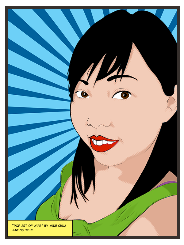
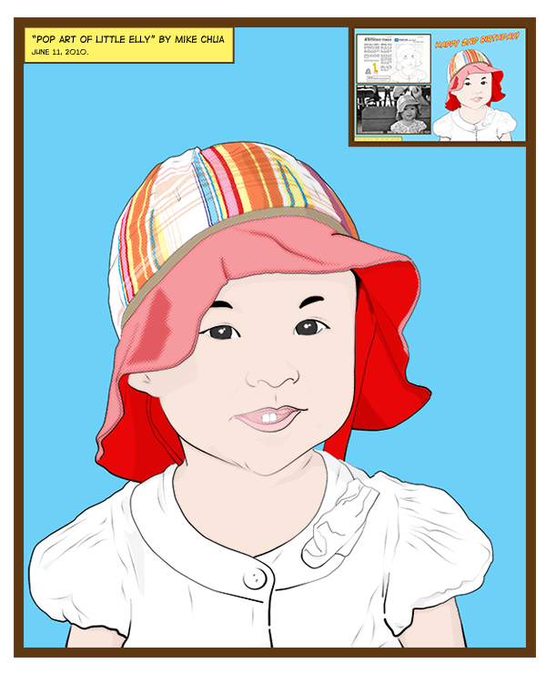
pop art inspired by Roy Lichtenstein
something i did this june. inspired by the great Pop artist Roy Lichtenstein. i use line art drawing as a base, after which colors and 'shadows' were added. i did not add any 'highlights', as i was hoping for a more authentic comic print look with a little more vibrancy in the colors. for a la-comic book look, halftone effect, dark color border and small text box was added to the final artwork. for the purpose of this posting, i have created an additional white border to make the artwork appears to be on a piece of paper. the artwork was purposely offset (i.e. not centralized) on the 'paper' to simulate the misalignment with the print or cut, which would likely to happen in older times of print process.
you can learn more about Roy Lichtenstein @ Wikipedia or artchive.
you can learn more about Roy Lichtenstein @ Wikipedia or artchive.
Friday, 25 June 2010
new name. new look. new design.
well, i have been thinking hard. after much evaluations, i decided to do away with 'the monkey life'. my name is mike and i like to talk, so i guess mike shouts pretty much sums it all up. my passion is in technologies and designs. i have always like drawing, and designing since young, and i shall make use of this blog site as an avenue for me to 'shout' about designs, opinions on gadgets and various other topics. don't worry, i won't burden readers with my personal gripes about life - that part will be kept lock in the attic ;)
about the logo...
i have always love the 60s & 70s American vintage look, especially on prints (ads!). i think they look awesome even till today. hence, i wanted my logo and blog banner to resemble them but with a touch of the 21st century. on top of the typeface 'mike shouts' is the official logo, yeah, that's me behind the bullhorn. it's 100% my design. i used 3 days working on the top banner, which encompassed the logo, 'mike shouts', and the 'junks'. so why the 'junks' on the banner? you know how some artist have thoughts of shapes, and some buildings, et cetera. me? the items in the 'junks', are just some of the many thoughts in my mind... at least, at the current state of mind. again, it's 100% my concept + design. i like to think & express. so here it is. last but not least, the background is of a real cardboard (some call it carton board). i just love the combination of advancement in technologies with natural form. dream.
that's it for now. in meantime, take care and live life to the fullest. live life because you wanted to, not because you have to, yah? cheers! ;)
concept sketch for the 'junks'.

Tuesday, 22 June 2010
the first ever made-for-torrent series: PIONEER ONE
VODO presents PIONEER ONE, the first ever made-for-torrent series. Pioneer One is a film by independent film maker Josh Bernhard and Bracey Smith (of indie film The Lionshare). Read more about this wonderful project @ vodo.net.

Synopsis:
An object in the sky spreads radiation over North America. Fearing terrorism, U.S. Homeland Security agents are dispatched to investigate and contain the damage. What they discover will have implications for the entire world.
Download the pilot episode of season one @ vodo.net. available in HD 720p H.264 MKV & Xvid
Monday, 21 June 2010
Apps Icons for iPhone & iTouch
i found some icons which i created a while back for some iPhone apps. the icons was based on a Theme, which i used on my 3G. i am not a fan of the stock icons for these few apps, so i thought i'd make my own. these icons are mainly for Singapore users, who uses the 4D & Toto, and the SG Transport apps. check out the preview:

the icons are free to download and use, but may not be redistributed or used for commercial gain. click HERE to download the icons.
the icons are free to download and use, but may not be redistributed or used for commercial gain. click HERE to download the icons.
i should learn to walk before i learn how to fly
with that said. i shall spend the next 2 weeks tidying up this blog page. i have since removed the rather annoying and sometimes, ugly ads (for now). a logo change is necessary, and hence, what we have here is a 'draft' of what's the new logo/banner will be. tidying up is the first, next will be beefing up the content with more up to date articles and hopefully, and hopefully a regular 'free download' such as icons, wallpapers et cetera and last but not least, it's time to think about driving traffic over here. so how's that sounds? ;)
a little something about the new 'draft' logo.
the whole idea of the new logo/banner was to have a vintage, old school travelling circus look & feel. i am not sure i am getting that feel for this piece. i did all my graphics on photoshop CS4. the main monkey logo was hand drawn, scanned and traced over on photoshop. 'the monkey life' logo is on a vintage circus ticket and i am still in the process of developing the rest of the abstract background. i used dominantly clouds because, that was all i had in my head right now. that's pretty sad, eh? the whole graphic was overlaid with a halftone layer, soften to give a 'old-time print on poor quality paper effect'. frankly, i am not quite please with this banner. i need to seat back and rethink... so what do you guys think? i hope hear to from the rest of the world ;)
ps: i am in the process of organizing my photobucket albums, so some photos or graphics hosted by it maybe affected. time to do some spring cleaning on photobucket...
Tuesday, 15 June 2010
quick look: Google Nexus One w/ Android OS 2.2 (Froyo)
instead of giving a lengthy take on the Google Nexus One, i will just summarize it. i got so much to talk about it but with my thoughts rushing, words became blurry. why not just hit straight to the point? or points? (note: i'm referring based on non-rooted set running on manually updated 2.2 Froyo)
pros:
- high resolution sharp display resulting from AMOLED display
- fast processor
- external storage in the form of SD card (bundled 4GB)
- beautiful design, teflon-coated casing was a nice touch - literally
- fast operating system
- reasonable battery life (about 1 full day with constantly fiddling with mails, web and various other apps)
- wireless sync (or was it cloud sync?) - its a God sent, without having to be tied to a particular PC or Mac.
cons:
- touch keys are not sensitive at times (seems like the angle of the fingers do matters)
- capacitive touchscreen is not as good as iPhone's (sometimes it doesn't detect my touch)
- the edge of the screen seems to be ultra sensitive. people with large hands may just trigger something when holding the handset
- syncing with Google Account could be a potential security issue (do you trust Google?)
- one platform with so many makes lead 3rd party software implementation. one software works with N1 may not works with Motorola Droid.
- lacking in apps library (partly due to the above-mentioned issue)
- hardware and software derive from 2 different entities which will not be as 'synced' as Apple's iPhone
- MMS (send) fails to work after manually updated to 2.2 Froyo, though i still can receive MMS
- why do we still need kill programs after we exit it?
i am kinda getting used to the Nexus One. if you have been looking at iPhone 3G/3GS for too long, trust me, you will find the AMOLED display much superior and pleasing to the eyes. this (the Nexus One) is just my transitional phone before the iPhone 4 comes along (after i managed to cracked my 3GS!).
for those still thinking is this phone is worthwhile, my answer is yes, if have never believed in iPhone and no, if you u think iPhone is great. it's all about perception. i don't want to live my life without trying and i am definitely not an extremist - i welcome technologies, whoever makes with open arms. back to question on the Google Nexus One's worth, i would think if you are a technology nut, then it definitely a big YES to give the N1 a shot.
Subscribe to:
Posts (Atom)